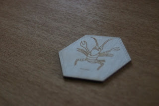
Here's my badge design I drew in illustrator.
This is how it came out, my next step was to start experimenting with different contrasts and creating more depth to my images.
Here I used a jpeg image with high contrast; I hoped it would create an interesting image once it had been engraved.
A short clip of the laser at work.
This is what the image came out like, the grain wasn't as prominent as I had hope however I did quite like the subtle effect. If I wanted a heavier grain I would have to play with the contrasts more on Photoshop.
I really enjoyed the workshop and will be preparing some experiments for the next session, I really want to laser cut into some quality paper, also have a stab at incorporating some moving parts.


