Wednesday, 31 October 2012

First Cut

I went to the First Cut exhibit in Manchester Art Gallery, I really enjoyed there was some great work there. It's really given me inspiration to be more ambitious with my ideas!


 I really liked this piece,
                                                        paper cuts and 
                                                         wildlife go hand in hand.


 The rich vibrate colors are breathtaking.

This is house is really beautiful, its delicate features in the foreground work really well. I would expected there to be allot of thing going on for the this to work but keeping in simple and dainty has worked well.


The use of books here really work well and create another dimension to the work.


 The shadow in this makes the whole thing work.

This map is a really simple but interesting idea, it changes the country and almost makes them unrecognizable while showing links between countries.


These are really simple but nice playful characters. 


I don't have much understanding of how this skeleton was done but I like it !


Tuesday, 30 October 2012

Laser Cut Workshop 6

We were set a brief to make a 3D piece, a box shape fitting together with slots. We were also given a choice of materials, wood acrylic etc. Here's my template, I drew a couple of designs on it then cut out some bars on the sides. I also did some engraving which didn't work so well on the bear but the other design I used three different depths of engraving, this was far more interesting when it came out.


I put a candle in it as I thought it look nice ! 


The lid and all the pieces fitted together first time, I was pretty pleased with that. If I was to again I would add more engraving with more layers. It was quite effective but making it more intricate and complex you could really create some nice patterns on this cast acrylic. 


If I was going to develop a 3D character further I would do something like this with allot off joints and slots,  I would also consider using magnets to have different elements be detachable.  


Monday, 15 October 2012

Laser Cut Workshop 5

For this brief we had to create a pop up character.


Here was my design the one on the left I drew at home illustrator, and brought in on a memory stick. I had accidently saved it as a jpeg file which meant I had to live trace it again in illustrator. That that got me confused as illustrator now had grouped the image together making all the lines be cut out rather than some is engraved and some be cut. So I redrew it


Here's some of the work I looked at to create my design, I followed this basic idea of the pop up mechanics but used a similar design. 


I left the image on the so I could it could help me get my around what would be cut what wouldn't, it pretty much confirmed my beliefs and didn't work. The other one didn't work either because I had no fill set up; it was just a simple matter of changing it on illustrator.

I burnt him. I set a little fire; my paper was too close to the laser. Either I had to turn down the power of the laser or move it further away.


Here he is !


Next time I do something like this I want to do some more engraving to add detail; it can look really good if it’s done well.

Laser Cut Workshop 4

We were given a brief to do a paper cut including 3 layers. It could be anything we wanted; I decided to just do some nice patterns. I looked at things like this to help inspire my design, the layered colors and patterns really build up a nice feel.


This is my first attempt, it went a bit wrong. I grabbed the image of the internet and live traced it using illustrator I then joined all the separate parts together so pieces wouldn't fall out. However when I got into onto coral I realized it had so many vector points that the paper would probably just burn. I had to compromise and delete a lot of sections. I still think it came out looking pretty cool.


Some of the sections that feel out, I thought they might be useful for something.


Here's my second layer, it came out much better that my first one although in some places it burnt a tad.
I had a piece of paper underneath and it left behind the other part which looked pretty nifty as well. I tried using this part but it didn't expose enough detail from the piece underneath. 


My third layer was just a circle to frame of the piece. 


I tried adding some of the left over pieces into this one but it wasn't too effective, if I had of cut something with a similar design I feel that could work really well.


Next time I have a go I'm going to draw my own design rather than take images of the internet, I think that will push my illustrator skills as I'm naff at the moment. I also think I should have joined the tree to a box so it fits into a A4 sheet like the example I looked at. It would finish it off and make it feel more like a whole piece, rather than bits just layered over each over. 


Monday, 1 October 2012

Laser Cut Workshop 3


We had a workshop on illustrator today; we were shown some really useful things for laser cutting.


Here we were looking at the cutting line and how it could be different to what is shown on the screen, by pressing command y it shows it, this will be extremely helpfully as it hopefully prevent any errors when coming to cutting.

Pathfinder tool is vital to the laser cutting process; it allows you to add subtract shapes together so that the line tool can follow them correctly.

Expanding lines proved very helpful, using the brush tool the expanding the line meant It would cut out the outside of the line rather than just the centre.


We used what had learnt to create layers and see what affects we could achieve. This is clearly a very simple example of what can be done but I'm looking forward to doing some more complicated things with this.


Vectorizing images, I got an image of Google then then applied tracing options. I then had to add lines so that it could be cut out using the laser. It was hard at first to imagine where the laser was going to cut but using the cutting line tool helped greatly. Hopefully it should cut out correctly next week.


Monday, 24 September 2012

Laser cut workshop 2

Here's my badge design I drew in illustrator.


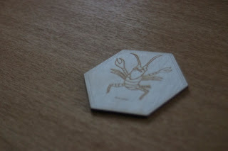
This is how it came out, my next step was to start experimenting with different contrasts and creating more depth to my images.

Here I used a jpeg image with high contrast; I hoped it would create an interesting image once it had been engraved.


A short clip of the laser at work.


This is what the image came out like, the grain wasn't as prominent as I had hope however I did quite like the subtle effect. If I wanted a heavier grain I would have to play with the contrasts more on Photoshop.


I really enjoyed the workshop and will be preparing some experiments for the next session, I really want to laser cut into some quality paper, also have a stab at incorporating some moving parts.